Dulux: Interactive Colour Discovery
Dulux: Interactive Colour Discovery
Dulux: Interactive Colour Discovery
About this case study
About this case study
The goal was to move Dulux beyond static paint displays and create a dynamic, interactive experience. By transforming a typically isolating task into a shared digital journey, the screen serves as a playful, social space where customers can collaboratively explore colors and spark decorating ideas together.
The goal was to move Dulux beyond static paint displays and create a dynamic, interactive experience. By transforming a typically isolating task into a shared digital journey, the screen serves as a playful, social space where customers can collaboratively explore colors and spark decorating ideas together.
Project Challenge
Project Challenge
Choosing paint in a busy retail environment is notoriously overwhelming. Confronted with endless walls of static paper chips under harsh lighting, shoppers struggle to visualize how a color will actually look at home.
To break past these physical limitations, this interface introduces a seamless digital touch experience that lets users intuitively discover, experiment with, and combine palettes in real time.
Services
Services
User Interface Design
User Experience
Component Library
User Flow & Information Architecture
Low/High-Fidelity Prototyping
Interaction Design
Illustrations
User Interface Design
User Experience
Component Library
User Flow & Information Architecture
Low/High-Fidelity Prototyping
Interaction Design
Illustrations
User Interface Design
User Experience
Component Library
User Flow & Information Architecture
Low/High-Fidelity Prototyping
Interaction Design
Illustrations
Tools
Tools


Discovery and Research
Discovery and Research
To turn a busy retail environment into a seamless digital canvas, the discovery phase mapped user intent against strict hardware constraints:
To turn a busy retail environment into a seamless digital canvas, the discovery phase mapped user intent against strict hardware constraints:
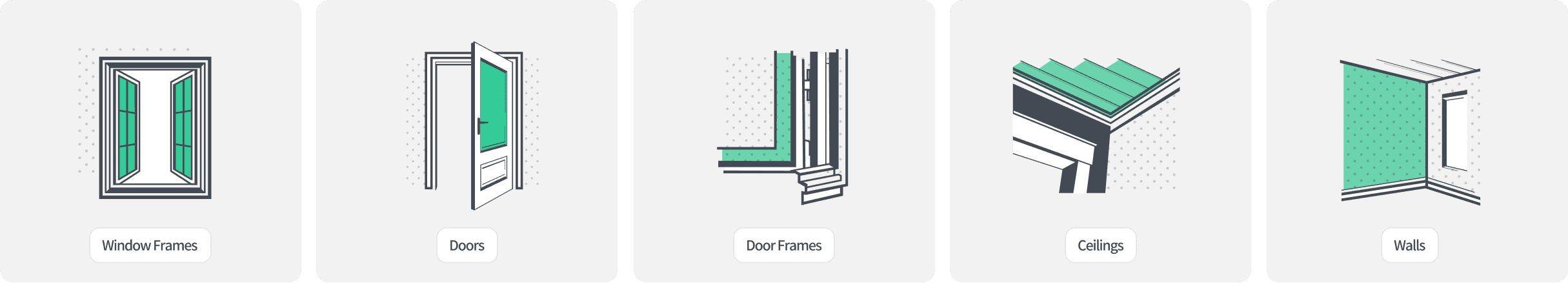
Simplified Architecture: Turned complex paint selector logic into a flat layout that eliminates user confusion.
UX Wireframing: Built and tested every screen from room selection to final palette creation to reduce user confusion.
Physical Reach: Positioned all interactive buttons within comfortable physical reach on the massive 86-inch screen.
Simplified Architecture: Turned complex paint selector logic into a flat layout that eliminates confusing.
UX Wireframing: Built and tested every screen from room selection to final palette creation to reduce user confusion.
Physical Reach: Positioned all interactive buttons within comfortable physical reach on the massive 86-inch screen.
Simplified Architecture: Turned complex paint selector logic into a flat layout that eliminates user confusion.
UX Wireframing: Built and tested every screen from room selection to final palette creation to reduce user confusion.
Physical Reach: Positioned all interactive buttons within comfortable physical reach on the massive 86-inch screen.

End-to-End Visual Execution
End-to-End Visual Execution
I designed everything from early-stage wireframes to high-fidelity interfaces, mapping the user journey to ensure a seamless, production-ready layout.
I designed everything from early-stage wireframes to high-fidelity interfaces, mapping the user journey to ensure a seamless, production-ready layout.


Visual Language
Visual Language
Designing for an 86-inch screen requires a deliberate departure from dense layouts. To counter a chaotic retail environment, the interface utilizes expansive whitespace and bold typography to anchor the user’s focus entirely on color selection.
Designing for an 86-inch screen requires a deliberate departure from dense layouts. To counter a chaotic retail environment, the interface utilizes expansive whitespace and bold typography to anchor the user’s focus entirely on color selection.
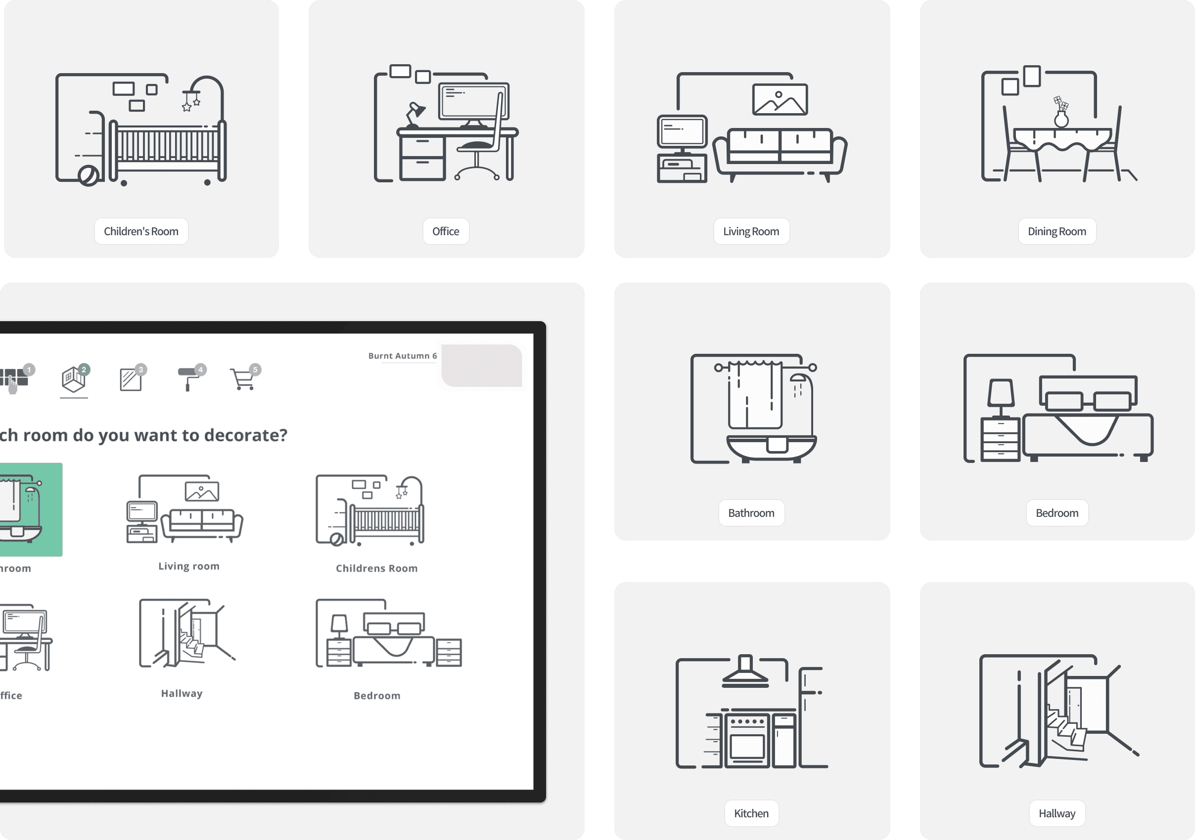
To minimize cognitive load, I designed a suite of custom, minimalist line illustrations representing core home spaces (Living Rooms, Bedrooms, Kitchens).
To minimize cognitive load, I designed a suite of custom, minimalist line illustrations representing core home spaces (Living Rooms, Bedrooms, Kitchens).
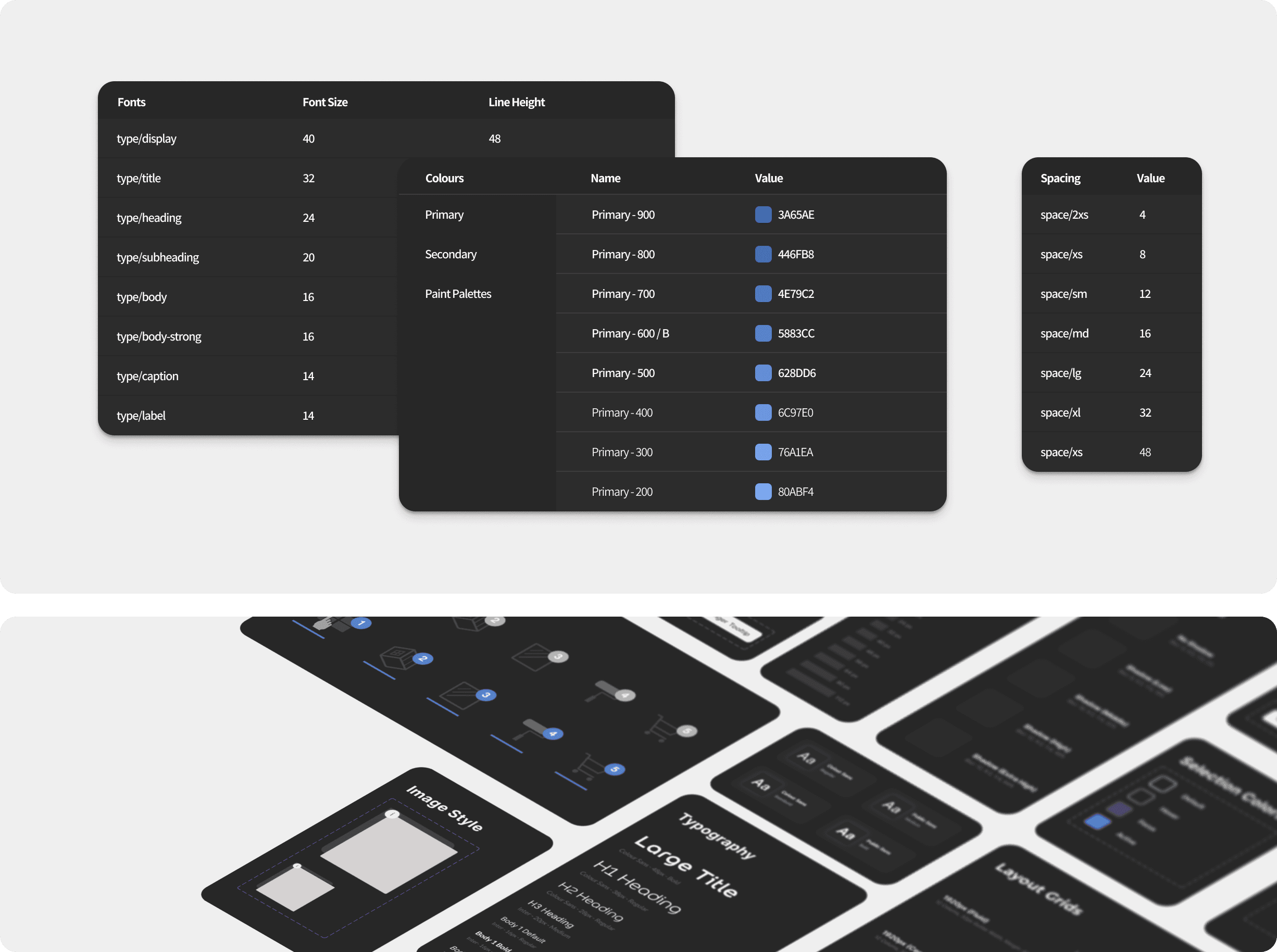
Created a structured variables library aligned with components and styles for precise, consistent execution.
Created a structured variables library aligned with components and styles for precise, consistent execution.
High-Fidelity Design
High-Fidelity Design